In my time as a designer, I’ve come across countless design dilemmas, some of which have been easily avoidable. Here are 5 of the most common design problems I’ve encountered as a professional designer, and how you can fix them and avoid them in the future.
1. Cramped, dark spaces
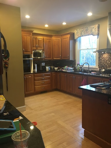
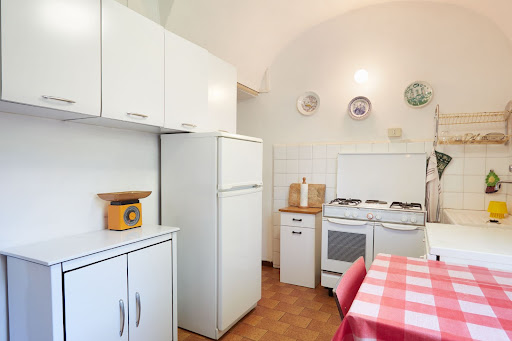
The picture above shows a “before” image from one of my clients’ kitchens. What’s wrong here? Generic and poorly placed lighting and a poor layout creates a major “traffic flow problem.” The entire kitchen lacks functionality as well. Not everyone has the option to expand their current footprint for any space in their home, but when you do have the opportunity to make a change, a little goes a long way!
2. Poor quality lighting or inadequate lighting
There’s nothing worse than a poorly lit space. I cannot tell you how many of my clients have come to me complaining that they don’t use certain rooms in their home, at all. Over the years, I’ve found that the greatest culprit is usually inadequate or poor quality lighting!
To help fix this issue, I’m a big fan of using “light layers.” That means using different sources of light in addition to light installations at multiple levels. A combination of ambient lighting, such as recessed downlights, which can be dimmed, combined with some decorative perimeter lighting, which comes from wall lights/sconces can make a big difference. I’d also recommend direct task or specialty lighting, like pendants over an island, or a cabinet that is lighted from within, to maximize both the beauty and efficacy of your lighting.
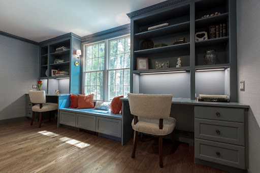
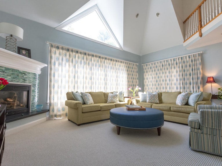
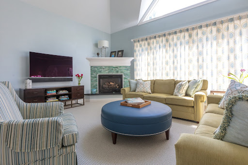
Below are images of my client’s renovated living room. The pre-renovated long, rectangular room was almost never used – largely because my clients didn’t know how to arrange the furniture in the room to maximize the space. Plus, the lighting was terrible. The room felt empty, sterile and completely unappealing.
So…we designed a beautiful built-in mantle at the end of the room to allow for a window seat and two desks. We also added two French doors and created a great new lighting plan. The new lighting was a combination of ambient lighting (recessed downlights), a beautiful central flush mount fixture, and sconces that flank the new window seat. The new space planning, furniture arrangement and well-balanced lighting now make the space much more appealing. As a result, the family uses this room all the time!
Here’s another before and after. In the first before image below, take a look at one client’s basement space, pre-renovation. Basements aren’t exactly known for their amazing lighting. That’s why it’s so critical to design and install great lighting in basements and underground spaces.
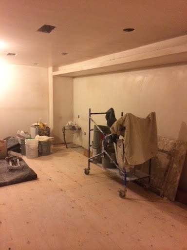
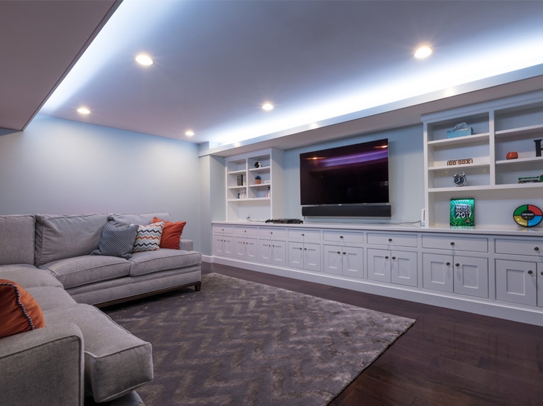
In the next image, you see that very same angle in the basement after all the work was completed. You can see how the multiple lighting sources make the space feel exciting, vibrant, and uplifting. This space has now become the ultimate play room, entertainment space, and lounging area for the family!
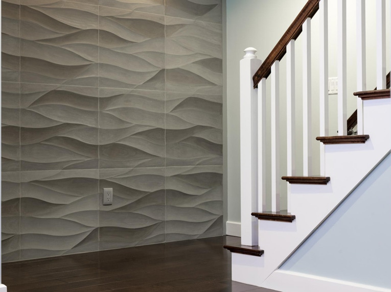
How gorgeous is that? Specialty lighting even highlights the curved stone tile that we used to add a little drama to the entry into the basement! (See below)
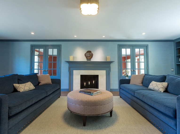
3. Dull palette and poor furniture layouts
Furniture can make or break your space. It’s not just about the furniture, though, it’s how you arrange it. Buying furniture “off the floor” of a showroom without a proper furniture plan laid out can be tricky for your space. You need to understand how those pieces will work together.
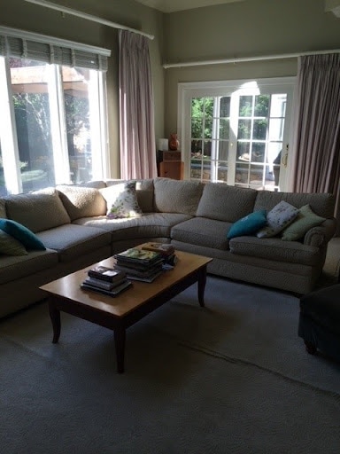
In the image below, my client’s “before” living room shows the dull, uninspired palette and furniture plan. The large sectional visually, and physically, takes up almost the entire living room space! It also contributes to a big sense of imbalance in the room.
In the after photos below, you can see the big difference. By creating a beautiful new color palette and a much more balanced and cohesive furniture arrangement, we took this room from bland to beyond gorgeous! Some of the changes include a new seating plan with two nice sized sofas with a side table in the middle in addition to a well-proportioned, comfortable ottoman and club chair. It’s all about finding balance and beauty!
4. No cohesive design concept
A “cohesive design concept” is a more abstract design concept plaguing many homeowners. Having a design concept is essential to creating successful spaces, whether that means planning a room around a color scheme or planning specific details to reinforce moods, ideas, and characteristics.
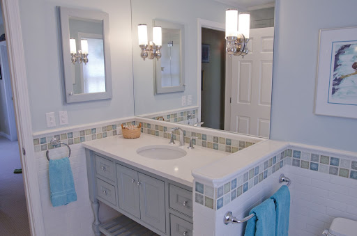
Below, you can see how design concepts can be used to improve even smaller, more compact spaces.
In the first photograph, you will notice a distinct theme: ocean and water repeated throughout the room to highlight the color palette, all blues, greens, aqua, and silver tones. It’s part of that beachy cottage style, noticeable in the vanity cabinet.
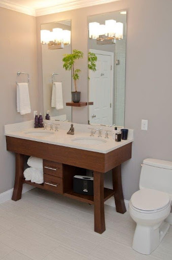
In the images below, you can see a different design concept: a zen bathroom vibe. How did we make this work? Japanese cabinetry design was incorporated in the vanity and all the elements and details reinforce both the Asian design features and the zen garden concept.
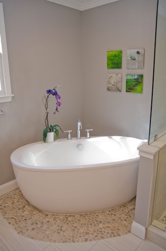
Don’t forget the details, either. In the bathroom below, the orchid and bamboo plant add peaceful greenery and color to the otherwise neutral palette of soothing and serene white, beige and soft grey. The pebble feature that encircles the bathtub in the following photo brings forth the natural, garden path sensation of this detail.
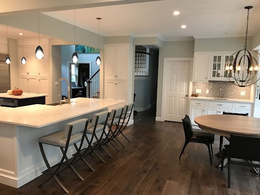
5. Ignoring the small details
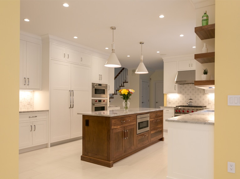
The little details can make a big difference in the overall look and feel of your new space. In the below photo, a renovated kitchen space, the small details help tie the space together – and it shows in the visual balance, beauty, and overall feeling of wholeness in the design.
The stunning wood tones of the walnut island are echoed in the walnut shelves on the right. The different white shades of the pendants, cabinetry and flooring all coordinate beautifully together. The grey and white marble backsplash tile integrates with the gray and white of the quartzite countertops. The stainless steel and the polished nickel hardware offsets the warmer tones in the kitchen and add visual brilliance.
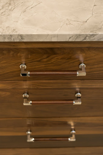
Don’t forget about the fabulous hardware on the island that looks custom made for the kitchen island. The polished nickel hardware pulls contain a solid walnut center section–which looks amazingly perfect against the walnut cabinetry! You’ve gotta love the little details that make a HUGE impact!
Of course, there are many endless design dilemmas and mistakes one can make when renovating their home. But I hope these 5 simple major design dilemmas (and their fixes) can help you when you next embark on a design or renovation project!
Remember: don’t compromise on the quality of your lighting, don’t be afraid of color, measure and plan before you invest in furniture and accessories, don’t settle for a dark, cramped space, and pay attention to the little details!
That’s all for today’s design lesson. Stay tuned for more design tips coming in my next blog!
Wishing everyone a very happy holiday season!