Do you ever wonder why two fairly similar kitchens can look so radically different? The layout, design of the cabinetry and even the lighting and tile elements in two different kitchens may look fundamentally very much the same, but the finished product can be substantially, radically different. One kitchen may just look good, whereas the other looks jaw-droppingly stunning. What is the “secret sauce?” When it comes to exceptional design, I like to say, “the devil is in the details!” In other words, it’s the small, often subtle (almost hidden) details that transform a space from average to amazing.
Recently, I had the pleasure of working with two of my wonderful clients, one in Sudbury, MA and the other in Bedford, MA to create brand new, dream kitchens. Although the overall style, tone, and mood of the kitchens are radically different, both boldly display the incredible impact of well-chosen details.
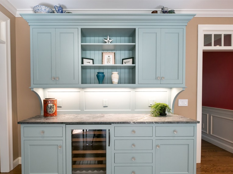
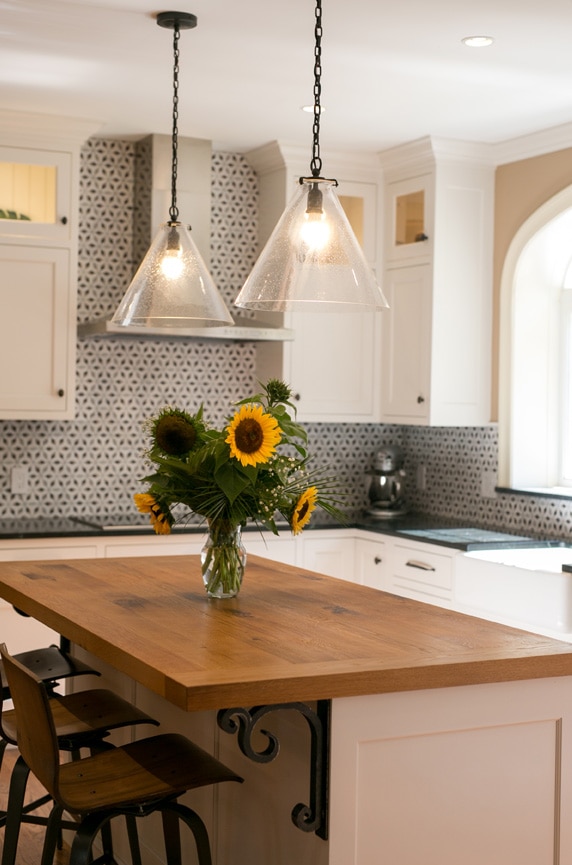
In the Sudbury kitchen, designed to be a beautifully updated, chic, somewhat more contemporary take on a farmhouse style kitchen, multiple design choices create a visual feast. The palette is warm, but well-balanced with beautiful textures and subtle shifts in warm browns, taupes, and cream, offset by a beautiful french blue cabinet. The creamy perimeter cabinets, detailed by a simple inset panel detail become even more striking by their contrast to the warm, rusticated wood top of the island.
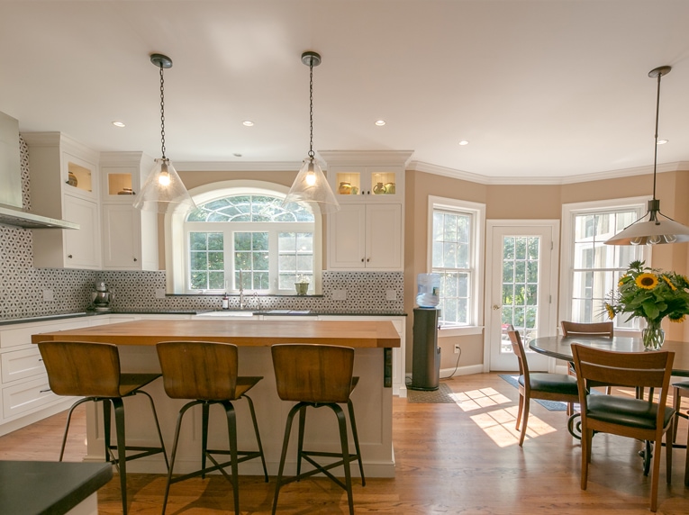
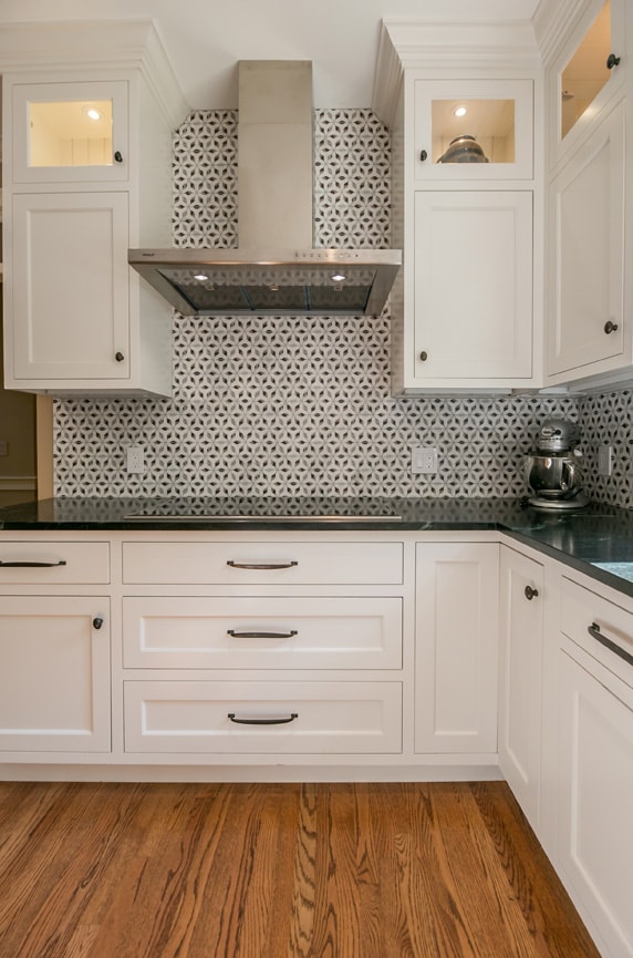
Several other great design elements bring additional visual delight: the large, seeded glass pendant lights over the island, the scrolled wrought iron brackets that anchor the underside of the island countertop, and the added sparkle of the crystal knobs that highlight the drawers and doors of the china hutch. The visual “WOW” factor of this kitchen is amplified by the gorgeous geometry, color, and texture of the hand-painted Stone Impressions tile. Painted and glazed directly on carrara marble, the pattern of this tile creates an intricate, dynamic symmetry that is pure visual delight. Glass and metal elements add depth with texture and warmth.
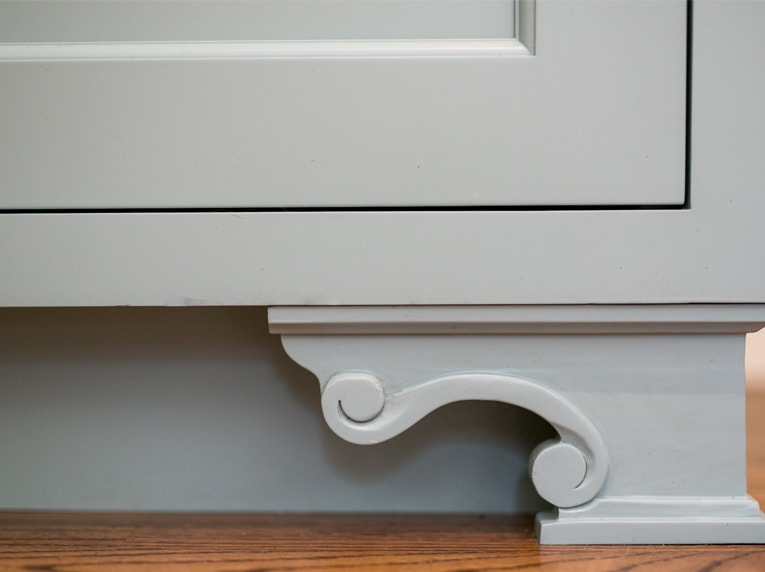
Color is, of course, another incredibly important element in good design. Monochromatic palettes can look very elegant and appealing, but most monochromatic schemes look best when there is an added “pop” of a beautiful complementary color. In this kitchen, our largely black/white/warm honey brown color scheme was offset by the gorgeous soft aqua blue (C2-Paints, Cadeau) of the painted hutch unit. It adds a bit of a “surprise” for the viewer, but also acts as a lovely, balancing counterpoint to the largely black and white palette. Notice the added subtle “dazzle” of the crystal knobs and intricately carved feet at the base of the hutch.
Hutch base detail: beautifully carved “feet”
Another master designer “trick” is repetition. Repetition can be in several of the same element, like multiple brackets, multiple panes of glass or wood panels, or multiple light fixtures. Repetition can also take the form of the repetition of color or a certain texture. In this kitchen, the wrought iron of the island brackets are repeated in the wrought iron of the barstool legs. The warm, honey brown of the flooring is repeated in the oak island countertop and the bent wood seats of the barstools. The human eye loves the harmony created by these beautiful visual ways of setting up rhythms of color and texture.
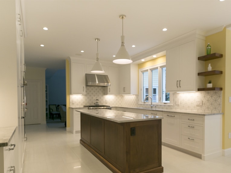
In our second kitchen, we have established a very different kind of visual feeling and tone. This space is all about light, subtle glitter and glamour and an overall feeling of crisp expanse and articulated geometry.
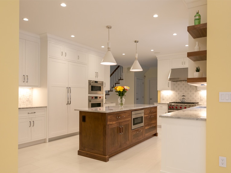
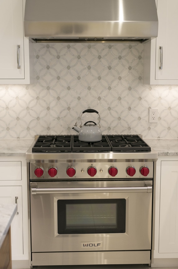
All our design principles and elements are also in bold evidence–we see them in the strong repetition of color (primarily white and grey) and the use of circular forms played against the rectangular cabinetry panelling. The quiet, painterly patterning of the white and grey quartzite countertop is beautifully offset by soft white cabinets with a simple, small inset panel detail. The largely white and grey kitchen feels clean and dramatic, and is warmed and grounded by the buttery yellow wall color. Once again, the stone tile steals the show–in this case, a stunning sparkling white Thassos stone with a mosaic pattern of mother-of-pearl. This subtle shimmering quality is picked up again in the grey and white stone tile backsplash of the hutch unit, combined with the dazzle of carefully selected grey and white mosaic tile. Again, the “pop” of red as a visual contrast color adds fun visual interest to our grey/white/yellow palette.
The light, bright feel, and visual continuity of this kitchen is enhanced by the stunning Visual Comfort glazed ceramic pendants over the island. Warm white porcelain tile “pavers” have been used for the flooring to create an even greater feeling of visual expansiveness and light.
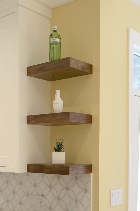
As in our Sudbury kitchen, we see added visual interest and harmony created by the gorgeous contrast created by the custom made, natural walnut island and the nice addition of the “floating” walnut shelves. These warmer elements are needed to ground the otherwise bright, white palette, and make the kitchen feel more visually balanced and complete.
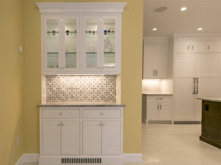
Finally, we look at the details that really make the kitchen “sing”. Both architecturally pleasing and interesting and functionally useful, the hutch unit adds the perfect element to delineate and set off the kitchen area from the adjacent sunroom eating area. Glass upper cabinet doors allow the soft glow of the interior light to radiate from inside the hutch cabinet. A different backsplash tile is used in the backsplash of the hutch to further set off the eating area and delight the viewer.
The “devil is in the details” again when we see how perfectly the walnut and nickel pulls on the kitchen island tie all our colors and different design details together. The nickel metal contrasts perfectly against the walnut wood, while the center walnut element of the pull integrates fully with the walnut island.
A design professional knows how to create this gorgeous visual “alchemy”. The next time you are ready to embark on a design journey, remember the details that can bring your design project from good to glorious!
Design Credits
Interior Design: Mast Design, LLC
General Contractor: Tom Knapp, Timberwolf Construction
Cabinetry Design: Woodwork Kitchens
Custom Walnut Island: Mcintosh & Company