We’ve all heard about the psychology of color, color theory, and all the emotions and feelings different colors can elicit in us. Think about how many expressions, related to mood, reflect specific colors: a black mood, a smile like “sunshine” (yellow), a rosy disposition, feeling blue, green with envy…Well, you get the picture, and the list goes on…However, all these color oriented expressions didn’t become part of our daily lexicon for no reason. COLOR IS POWERFUL! Being surrounded by certain colors can radically (and rapidly) change our mood, our level of creativity, our sense of peace (or agitation), even how hungry we feel!
I was both reminded and overjoyed by the wonderful, exuberant display of color in the clothing worn by the politicians, artists, and celebrities on inauguration day. Whatever your political views, the day brought us a shot in the arm of incredible, head-turning, heart-stopping color! From Lady Gaga’s sumptuous, vibrant red silk, to Amanda Gorham’s canary yellow coat, we were stirred and awed by the abundance of glorious color.
Before I even understood WHO Amanda Gorham was, I couldn’t take my eyes off that bright, hope-inspiring, shot-in-the-arm shade of yellow. That color suited her perfectly–not simply because it looked amazing and regal on her, but because it brought us straight to attention, while also infusing us with a sense of uplifting sunshine filled light.

Jill Biden’s gorgeous, more serene blue (highlighted with subtle glitter) was equally visually beautiful, but presented a mood of stability and calm. Blue is mostly often reported to be people’s favorite color, and it comes as no surprise that our new first lady chose this lovely shade of the world’s most popular color.
In Interior Design, the use of color is no less important and no less tied to how, ultimately, it will make us feel. The references to the symbolism and meaning of color can be found in literature as early as the original Old Testament. It goes without saying that our preferences, associations and likes and dislikes of different colors are influenced by trends, culture, subculture, age, gender, socially based differences, temporal factors and personal biases and preferences.
As such, one of the first conversations I have with my clients when starting a project is to ask: “What colors do you gravitate towards?” “What colors do you like to wear?” And, “How do you want to FEEL when you are in the new space or room?” The answers, naturally, vary widely, but do inform a lot about how I then approach the design and decor choices for a project. For example, those who say they want cool, soothing colors also (usually) want a space that also feels more open and airy, vs. warm, cozy and filled with objects and lots of visual stimuli.
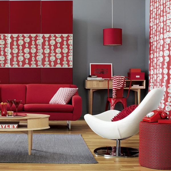
The intense red room below is stimulating, exciting, but also would not be described (I don’t believe) as being soothing or calming to the senses. What’s important in designing residential interiors is understanding both how unique and personal our perception of color is, and how to then translate that personal relationship with color into pleasing interiors that resonate and make the occupant feel the way they want to feel!
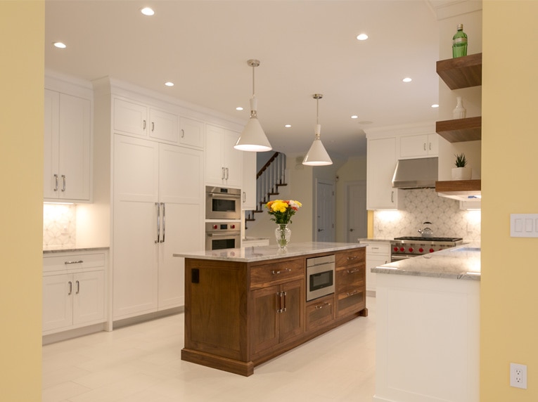
This white and yellow walled kitchen, for example, suited my clients’ tastes and visual aesthetic perfectly. The white flooring and cabinetry could have become overly sterile, but the cool glamour of the bright white is warmed and brightened by the soft yellow walls. Additionally, the beautiful, natural walnut wood creates even more visual warmth, providing us with a nice warm/cool balance to the palette and color scheme.
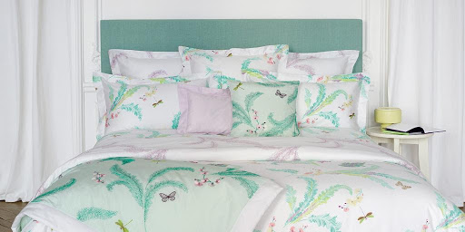
The beautiful French linens company, Yves Delorme, gets that warm/cool, advancing/receding balance of colors just right in their beautiful bedding seen below. Green, a color associated with freshness, nature, and healing/soothing qualities is balanced and offset with a pop of soft pinks and yellows. The result is fresh, happy, yet bold enough to be both pleasing and delightful.
The colors found in nature never get old, and we can see the harmonious “play” of the contrasting colors in full view. The cooling visual of the aqua blue water makes an incredible, gorgeous contrast against the warm green of the moss and the grays of the surrounding stone. I could easily see creating an amazing room with this palette–warm to cool greys, soft whites, aqua and moss green.
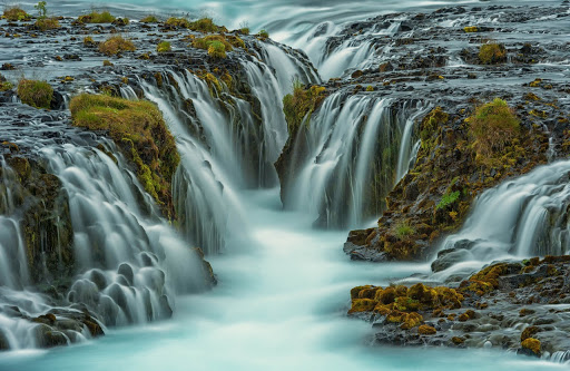
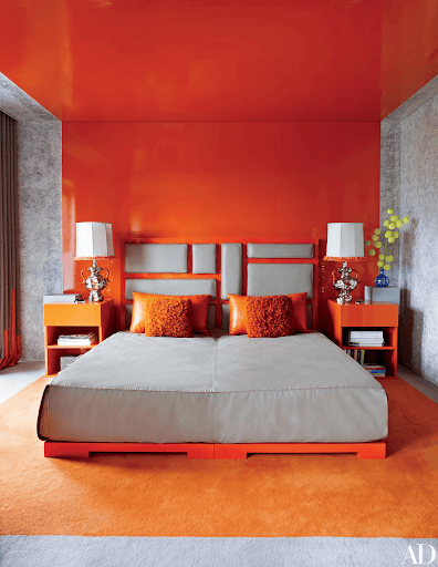
Consider the difference in mood and impression in viewing the Icelandic waterfall image versus the image immediately above! The “hot” orange of the bed frame, rug and side tables creates an instant rise in blood pressure–exciting–and intense visual resonance. Now, I love this room, but I (personally) wouldn’t choose these colors for my own bedroom. The design and color work so well, however, because the “heat” of the orange is cooled by the contrast of the soft, cool gray. This is a great example, as well, of how impactful a simple two-color palette can be.
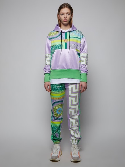
Purple and Yellow (or purple and gold) is another classic complementary color scheme worth some attention. While generally a much more dramatic color pairing, this dynamic scheme is historically one of the most popular. Purple has long been associated with royalty, and (because the dyes to make purple fabric were rare and expensive) still retains this association. The Versace fashion label’s clothing and accessories, for example, are full of purple and gold combinations. It comes as no surprise that this fashion house is founded on a design sensibility linked to Italian Renaissance and Rococo history and art, and certainly royal symbolism and color.
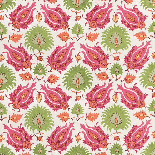
In residential and commercial design, the use of the classic complementary color palette is employed widely to create the kind of instant resonance and visual impact that only a complementary color palette can do. Brunschwig & Fils has a new line of fabrics that display this gorgeous complementary color methodology brilliantly. In the fabric below, we see the classic red/green complementary color scheme–in this case the red is a lighter hue (pink is red with white added) and a beautiful lighter, grass green. Fun fact: this same red and green palette is used all over the interior interior decoration and is the color palette literally everywhere in the house in Home Alone! (Christmas Joy!) and complementary color genius!
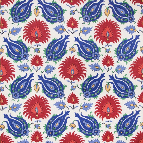
It’s fun to see how completely the feel and impression of this fabric changes when the same pattern is translated to a totally different color scheme. Instead of the bright, fun, uplifting complementary scheme, we now see the fabric in a fundamental primary color scheme of bold red, vibrant blue, and strong yellow. While both fabrics are certainly appealing and eye-catching they make a very different statement. To me the pink/green version feels playful and light-hearted, while the primary color scheme feels bold and a bit more “serious.”
Color is ultimately a very personal thing, I have found, so pay attention to the colors that attract (or possibly) repel you, and you will start having a good idea of your own color sensibility and personal visual tastes.
So, the next time you are designing your house, buying your partner a sweater, or creating your new business logo, remember the power of color! The symbolism, meaning and associations attached to different colors differ both through the ages and within different cultures. Color has the power to uplift, stimulate, and create feelings of joy. It can also repel, evoke strong feelings, and illicit particular associations. Understanding a little about the psychology and theory of color can go a long way to knowing how to use this powerful visual tool! Enjoy your color journey!